
Who comes back to play again?
Intramural Sports Participation Analysis
Eight seasons of participation records, turned into a clearer picture of who signs up, who plays, and who comes back.
Was the program losing players, or were the numbers telling us something else?
Actual participation held roughly steady from 2022 through 2024, then fell in 2025. Declining new-player intake pointed toward an acquisition problem.
My role
I was the sole analyst: I consolidated and cleaned the records in Excel, built Tableau dashboards, and developed recommendations. Nearly four years inside the program, as an official and later a manager, helped me know which questions to ask.
2018-2025 · 8 seasons · 4,169 player-years · Excel and Tableau
What the records showed
Actual players held steady before the 2025 decline
Players with at least one game · scale 0-800
View chart data
| Year | Players with at least one game |
|---|---|
| 2022 | 711 |
| 2023 | 721 |
| 2024 | 720 |
| 2025 | 648 |
Track interest and attendance separately. The share of rostered players who showed up rose from 47% to 64% over 2022-2025.
Players who played more were more likely to return
Returned the following year · scale 0-100%
View chart data
| Games played in first year | Returned the following year |
|---|---|
| 1-2 games | 23% |
| 3-5 games | 49% |
| 6-10 games | 66% |
| 11+ games | 84% |
Test ways to help new players finish a league and find the next one. This association does not prove that extra games cause retention.
Three more findings
The front door was narrowing
New-player intake fell from 371 to 339 to 323 to 283 over four years, a 24% decline. Returning players covered the gap until 2025. That points attention toward how people first find and join the program.
People came back together
Players whose social group persisted returned at 70-78%, compared with 29% when the group dissolved. Only 42% of groups persisted. Group continuity and individual return are linked decisions, so this does not isolate a causal effect.
A small core carried a lot of activity
The top 10% of players, 293 people, generated 44.5% of recorded activity. Captains returned at 55%, compared with 43% for other players. Captains are a useful contact point, and reliance on a small core is also a risk.
What I recommended
Proposals based on the analysis. These are not reported as changes the university has adopted.
Separate interest from attendance
Report rostered students and students who played as two named measures. Every target should say which it means.
Give recruitment an owner
Set a new-player intake target and ask how students heard about the program at registration.
Help players reach their next league
Protect new-player leagues from forfeits and make the next opportunity easy to find, within the same sport or across sports.
Make it easier for teams to return
Simplify team renewal, prompt graduating captains to name a successor, and test captain-led recruitment.
Why this mattered to me
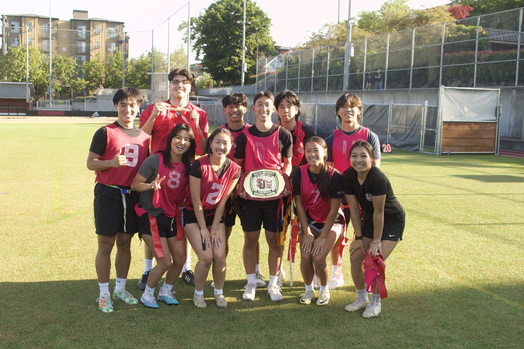
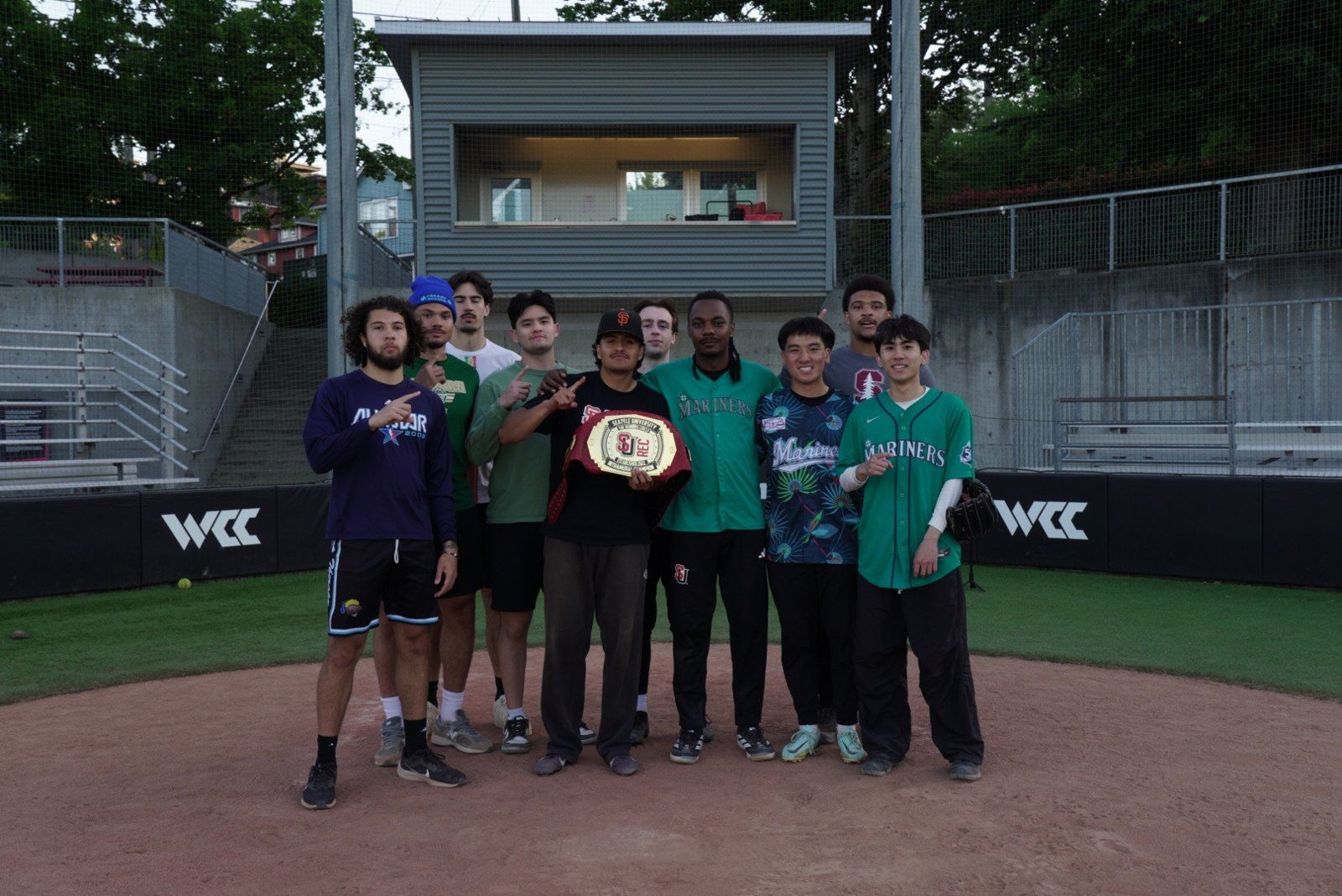
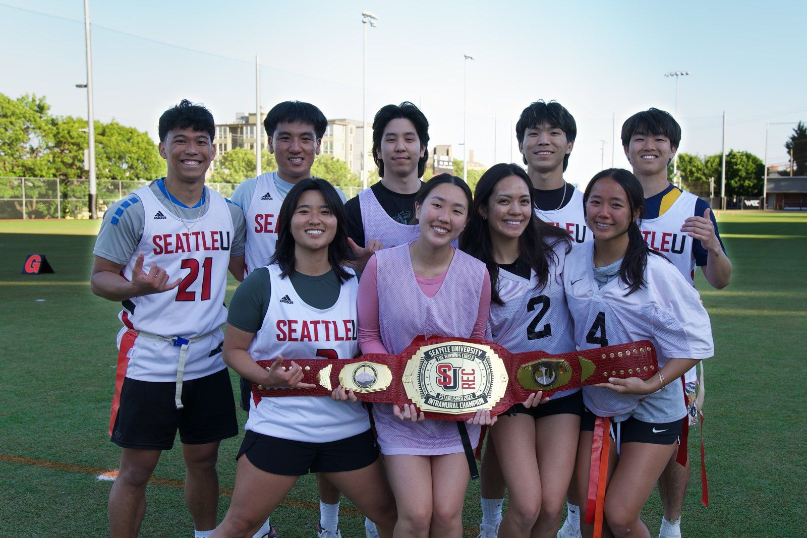
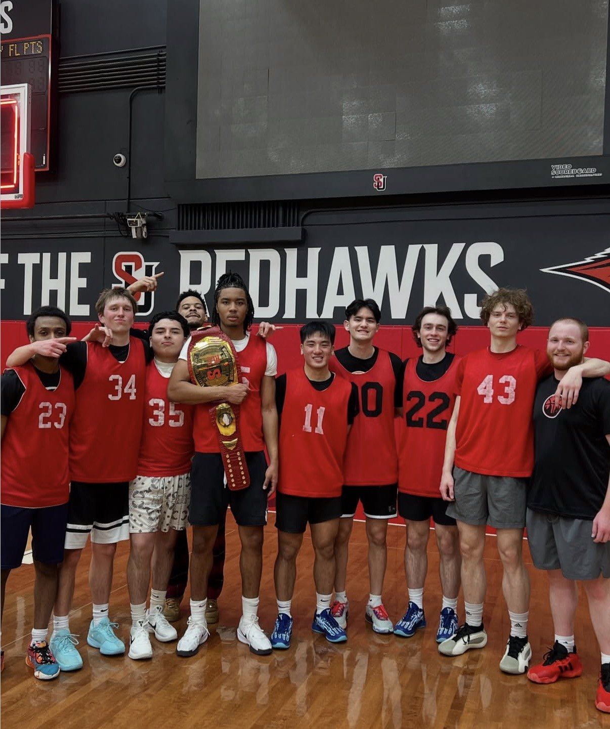
I knew this program as a player, employee, and manager. As my data skills grew, I wanted to put them to use for a community I cared about, so I took the initiative to investigate the participation records and look for ways to help.
Method and limits
These findings describe associations, not causal effects. The analysis and dashboards are complete. UREC brought back the t-shirt prize promotion from these recommendations; the others remain proposals. Student-level records belong to the university; only aggregate findings are shown here.
Read the analysis method
I consolidated and cleaned 2018-2025 participation records in Excel and analyzed cohorts by first-played year. For group continuity, I matched next-year teams in the same sport family sharing at least three members or a Jaccard overlap of 0.4 or more. Team names alone were too noisy: about 10% persisted, compared with 42% of the underlying groups.
What I took from the work
Working inside the program helped me ask practical questions. The analysis then challenged the initial reading of participation: fewer roster spots did not always mean fewer people playing.